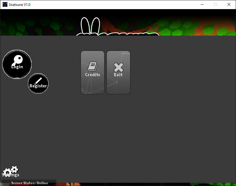
The gray represents the border limit of where I can place buttons. It may look fine on 800 x 600. However:
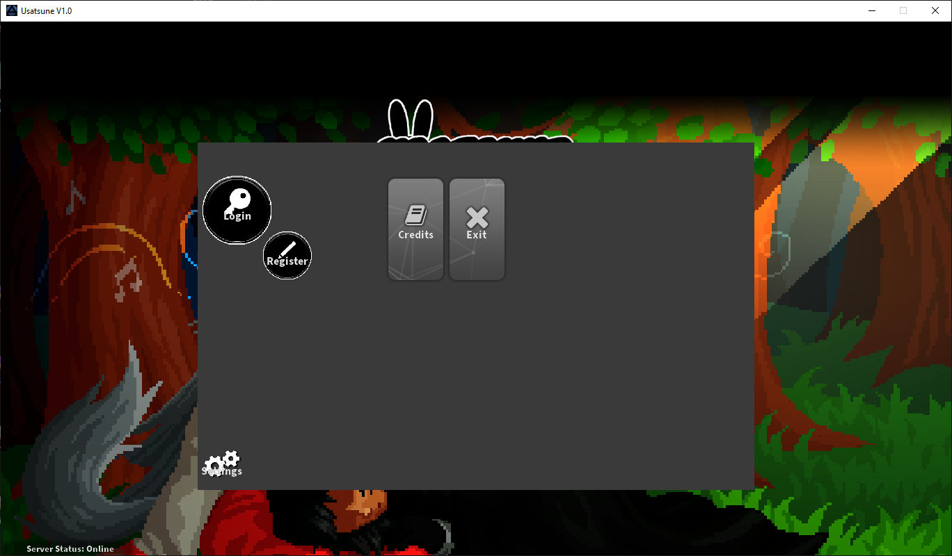
Expanding it to 1366 x 768 buttons will only restrict itself to it's parent. If I try to expand the gray area, the Settings will get lost in the void.
I need to set it so that the buttons are it's own function and not part of MenuWindow.json. Otherwise I will just have buttons floating around. That or I add a graphic in the center and call it a day. If anyone has any input or ideas on how to get this working it would be mostly appreciated.
- Changes made, in MenuWindow.json
Line 1: {
Line 2: "Bounds": "283,174,800,500", (This is the size of that gray area)
- Replaced the Main menu (Will be either graphic or transparent.)
- Login Button replaced and resized.
- Register Button replaced and resized.
- Settings Button replaced and resized.
Question
Eridonis
The gray represents the border limit of where I can place buttons. It may look fine on 800 x 600. However:


Expanding it to 1366 x 768 buttons will only restrict itself to it's parent. If I try to expand the gray area, the Settings will get lost in the void.
I need to set it so that the buttons are it's own function and not part of MenuWindow.json. Otherwise I will just have buttons floating around. That or I add a graphic in the center and call it a day. If anyone has any input or ideas on how to get this working it would be mostly appreciated.
- Changes made, in MenuWindow.json
Line 1: {
Line 2: "Bounds": "283,174,800,500", (This is the size of that gray area)
- Replaced the Main menu (Will be either graphic or transparent.)
- Login Button replaced and resized.
- Register Button replaced and resized.
- Settings Button replaced and resized.
Link to comment
Share on other sites
4 answers to this question
Recommended Posts